01 / The client
About the client
360 ONE is a wealth and asset management group in India. Its corporate website introduces the group and links visitors to its separate businesses: 360 ONE Wealth, 360 ONE Asset and 360 ONE Capital, along with the 360 ONE Foundation.
The site's main navigation also carries About Us, Perspective, Investor Relations and a Client Login link, so the same header serves prospective clients, existing clients, investors and general readers.
The parent brand uses a stark black-and-white identity with a stacked 360 ONE logotype. It appears in the header and section panels, and as a badge on each business card, tying the businesses together visually.
- Industry
- Fintech
- Services / expertise
- Website · Wealth and asset management
- Client
- 360 ONE
- Industry
- Wealth and asset management
- Service
- Website
- Live site
- 360.one
- Client website
- Visit 360 ONE ↗
02 / The project
What Ackrolix delivered
Ackrolix's portfolio lists 360 ONE under wealth and asset management, with the service type recorded as Website. The work sits in the digital layer: how the brand and its businesses are presented online.
This profile walks through the live corporate site as it appears today. It describes the website only. It makes no statement about the group's financial products, advice or performance, and nothing here is investment guidance.
A corporate website for a regulated financial services group has to stay clear and restrained. Visitors include clients, prospective clients, shareholders, journalists and job seekers, and each group needs an obvious route to what they came for.
- Client: 360 ONE
- Industry: Wealth and asset management
- Listed service: Website
03 / The project
Brand commitment and client principles
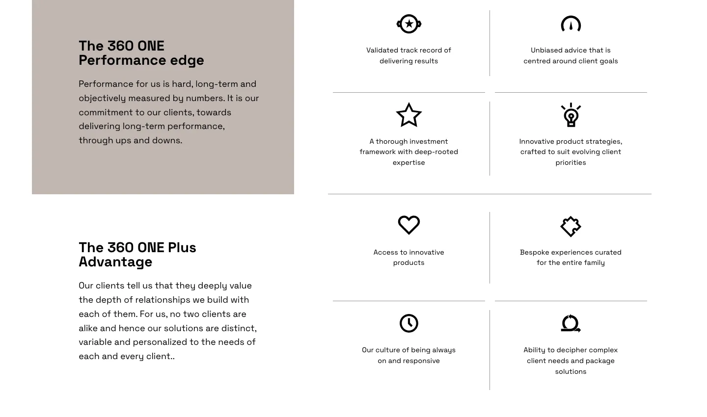
Below the opening area, the homepage sets out the brand's positioning in plain language. A section titled "The 360 ONE Performance edge" sits on a muted taupe panel next to a grid of four line icons with short statements.
A second block, "The 360 ONE Plus Advantage," follows the same pattern. A short paragraph on the left explains the brand's approach to client relationships, while four more icons on the right list themes such as responsiveness, experiences for the whole family and packaging solutions for complex needs.
The icon grid breaks a values statement into scannable points. Visitors can take in the message without reading long paragraphs, and the thin divider lines keep the layout calm and orderly.
The copy in this part of the page describes the brand's relationship with its clients rather than individual products, which suits a corporate homepage whose job is to introduce the group.
04 / The project
Offerings and the Wealth business
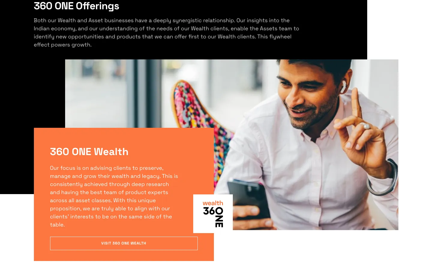
A black band titled "360 ONE Offerings" introduces how the group's businesses relate to each other. It leads directly into the first business feature: 360 ONE Wealth.
The Wealth block pairs a wide lifestyle photograph with an overlapping orange text card. The card holds a short description of the business, a "wealth" variant of the 360 ONE logo, and an outlined "Visit 360 ONE Wealth" button that sends visitors to that business's own site.
The overlapping card and photo give the section depth while keeping the text on a solid background, where it stays legible.
The Offerings introduction uses light text on black, a visual break that marks the move from brand values to the businesses themselves.
05 / The project
Asset management feature
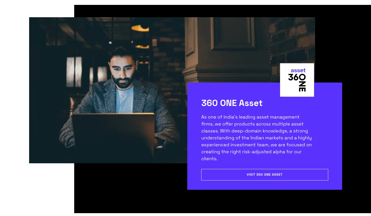
360 ONE Asset gets its own block, built on the same pattern with the layout mirrored. The photograph sits on the left and a violet text card on the right carries the heading, a short business description, an "asset" logo variant and a "Visit 360 ONE Asset" button.
Each business has its own accent color: orange for Wealth, violet for Asset and blue for Capital. That gives each business its own identity within the parent brand. A visitor scrolling the page can tell where one business ends and the next begins without reading every heading.
The black backing panels behind each photograph sit at slightly different offsets from block to block. The layout feels varied even though the structure repeats.
06 / The project
Capital feature and navigation to each business
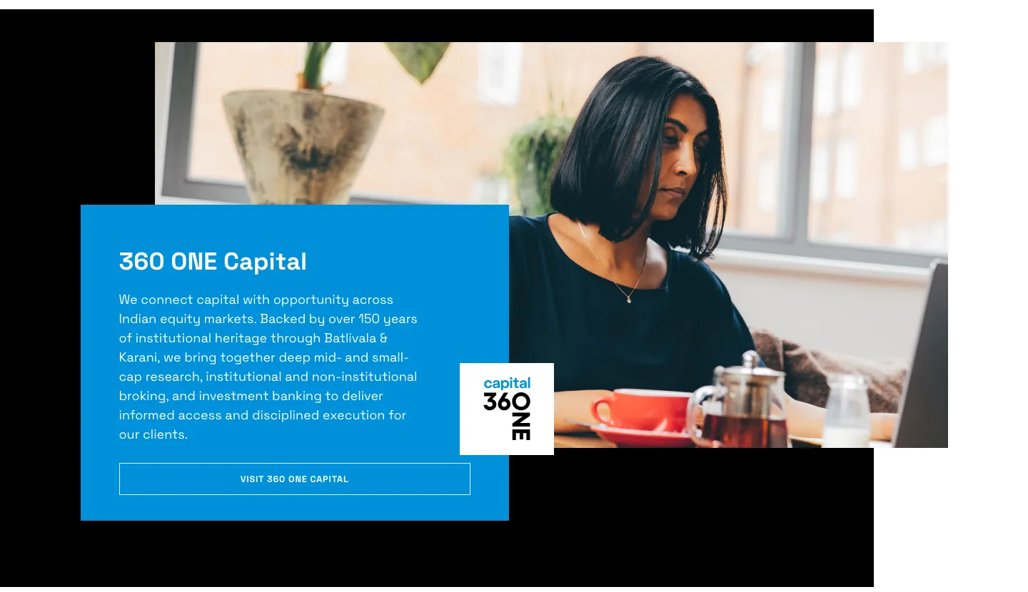
The last business block introduces 360 ONE Capital, again with a photograph, an overlapping blue card, a "capital" logo variant and a "Visit 360 ONE Capital" button.
With three blocks built from one repeating pattern, the homepage works as a directory for the group. Each feature ends in a single clear action that takes the visitor to the relevant business, while the parent site keeps the shared brand story in one place. The footer that follows repeats links to each business and to client and investor logins.
07 / The project
Why this approach suits a multi-business group
A financial services group with several businesses needs a corporate site that explains the whole before sending people to the parts. A repeated block pattern, logo variants for each business and one accent color per business do that without crowding the page.
Keeping logins, investor relations and business links in the header and footer separates audiences who arrive with a task from those who are exploring the brand. Readers who want product or regulatory information are directed to the relevant business site rather than to the corporate homepage.
A restrained palette of black, white and taupe also leaves room for the three business accent colors to stand out where they matter.
For a similar group website, a useful starting point is to map each audience to a destination, then design one reusable block per business. New businesses or initiatives can then be added without reworking the page.
- One shared layout pattern for each business
- A separate accent color and logo variant per business
- Persistent links for clients, investors and readers
Questions about this project
What did Ackrolix work on for 360 ONE?
Ackrolix's portfolio lists a website engagement for 360 ONE in the wealth and asset management sector. This profile describes the live corporate website.
Does this profile describe 360 ONE's financial products?
No. It covers the website's structure and presentation only.
How does the site present the group's different businesses?
The homepage uses one repeating feature block per business, with its own accent color, logo variant and a button linking to that business's site.
Prepared by Ackrolix Innovations from its development portfolio, pages 117. Project profile based on the documented service scope. About the team.